A place to digest why the tech news actually matters. From app and gadget reviews to liveblogs and how-tos, you'll find it all right here, for geeks and the tech illiterate alike!
Saturday, May 21, 2011
HTC EVO 3D and View 4G Preorders Are Go!
Are you looking for your next Sprint upgrade? Just have an affinity for 3D screens? Or do you love HTC so much you need their tablet? Good news then. Sprint is now officially accepting pre-orders for both the HTC EVO 3D and the HTC Flier 4G. Strangely, RadioShack and Target Mobile beat them to the punch on the EVO 3D preorders, but all three places will take just $50 of your pocket money for the guarantee of getting a device on Day One. Problem is, no one knows when Day One for either device is. Or how much they will actually cost come Day One. But no matter when and for how much, you'll get one that day, and the $50 is put towards the purchase price.
To recap, the HTC EVO 3D is the US' first 3D phone, with a 4.3" qHD screen similar to the 3DS. No glasses required. You also have a 1.2GHz dual-core processor to help handle the dual 5 megapixel cameras on the back for 3D pictures and video. It will run HTC's newest version of Sense on top of Android 2.3. The Flyer is HTC's first tablet, rocking a 7" screen and Android. What sets this one apart is that you can also buy a special stylus for input, making it very easy to draw and write notes.
So who's getting one?
Review: Google Music Beta
Before I get into this review, I'd like to make 2 disclaimers. The first and most important is that this entire service is Beta. There are imperfections that will no doubt be addressed. The second is that this is really 2 sneak peaks: One for the webapp and uploader, one for the Android app. Now, the good stuff.
First up is the meat and potatoes: The web interface and uploader. The uploading is incredibly easy. After a quick download and install, the Music Manager will scan your computer for the music. To avoid getting the random sound effects on your computer, you can have it scan through iTunes, Windows Media Player, or specific folders. Everything is done in the background, so you don't need to pay attention to it at all. You can also have it automatically run upon start up, keeping this truly out of sight and out of mind. The average library has a lot of music, mine being about 19.5Gb of tunes. At the time of this writing, I'm at 387 track uploaded after a few hours in, so completing this task will take a long time. The good news is Google promises each user 20,000 songs. My 19.5Gb accounts for roughly 4,000 tracks. The one issue I have is that I use iTunes, which means I don't really keep track of what the files are actually named. Since many tracks have numbers in front, and as far as I can tell the Music Manager uploads in alphabetical order, some albums can't be listened to in full.
The web app will look very familiar if you've used the web version of the Android Market. Everything is very tab-centric, making it incredibly easy to use. On the left side, you have the traditional ways of sorting through your library (Songs, Artists, Albums, Genres). Under that you get to the mixes and playlists. The auto-playlists sort out the songs you've Thumbs Up'd, your recently added stuff, and the free music Google is giving out. There's not a lot of it, and it's mostly a song or two per artist, but it's nice to get free stuff.
There are two kinds of playlists. You have your traditional playlists that you custom make by drag-and-dropping songs. The Music Manager also pulls your playlists from iTunes, which is very cool. You can also create Instant Mixes (a la Genius Mixes from iTunes) from individual songs or albums, adding in similar jams. Along the bottom is the Now Playing bar with the familiar Play/Pause, track navigation, Shuffle, Repeat, and Volume controls. I think the Now Playing bar could be a bit thinner. The width of it and the banners at the top make the song and album lists seem a little cramped. While the overall look isn't as visually impressive as the Zune player, it looks a lot better than iTunes but still has the information that iTunes has. Overall it's a very easy to use service while still looking very nice.
Now the dessert. The Android app is very basic, almost to a fault. First thing's first, it works pretty well. It decided to scare me by force closing the first time I tried to play a song, but every time after it worked well. Songs take very little time to load up on WiFi, though it does take a little bit longer on 3G. Swiping left and right switches through album, artist, etc. views. When on the now playing screen, you see the album cover, Play/Pause, song and artist name. One cool thing is being able to make custom playlists in the Now Playing screen, though it would make more sense to be able to make Instant Mixes from this screen. Maybe we'll get that later. You can also download songs or albums from the Library view and Now Playing screen.
The main problem with the app is a visual one. It's just boring. Like really boring. You're given a blurry, boring background picture. There's no animation between screens, nothing. It's just blah. It would have made a lot more sense to keep the color scheme and overall feel of the web app, while tweaking it a bit for smaller screens. The other small problem is that the name of the app is Music. So is the stock music app for Android. While the icons are different, this can be a bit confusing. They should made it Google Music for differentiation.
The biggest problem facing Google Music is the complete lack of a store. Google Music, as it is now, is just cloud storage and streaming. What's weird is that in both the web and Android app, you can "shop for artist", but it just does a Google Shopping search for that artist where you can buy the songs from somewhere else. This may work for now, but it isn't a longterm solution when Amazon is offering very similar services. Google is trying to get the labels to get on board in some fashion, but how long it will take and in what form we'll get the music remains to be seen. I'm hoping for a subscription service, and knowing how Google does things (and a fair amount of rumors supporting this theory), it's very likely that that is what we'll get.
Overall, Google Music is the best solution to having too much music to fit on your phone. While I'm also a big fan of subscription services like Rdio, they just don't have everything I listen to. Amazon's cloud storage is good, but it lacks a well done web player and uploading your stuff is obnoxious. Google nailed the upload and web version for sure. Once they lock in the record deals and make the Android app visually appealing, Google Music may just be the best music solution yet.
Want some Google Music action of your own? Click here to apply for an invite!
Thursday, May 19, 2011
Re-Securing Your Passwords
So, a lots happened since I've been gone. Been a crazy time personally and online. The biggest news since last I wrote has been the massive amounts of security breaches. From Epsilon leaking out our email addresses to Sony's Playstation Network disaster, our online logins and passwords have been in the hands of God knows who. But do you really want to trust that some neckbeard in a dark basement to not start buying stuff on Amazon? I don't.
The main problem that people have is using the same password across all of their services. In the past, this was never a big deal. But now, our online identity is so tied in to our daily lives that we can't regard all of our accounts to be on the same level of importance. My solution: The Three Tiered Password System.
Make a list of my most visited sites. Then asked yourself how important each one is. Not sure? Think about how pissed you'd be if someone else got access to that account. My list involved your basics, Facebook, Twitter, Amazon, Netflix, eBay, Gmail, banking sites, etc. I broke that list into 3 tiers.
Tier 1 consists of non-important things like Hulu, Netflix, forums, and then accounts for apps like Words With Friends. I used my traditional basic password. It's not the most secure, but on this tier, even if my password is guessed, all someone could do is change my Instant Queue and waste a Triple Word Score. This password is memorable and easy to type in.
Tier 2 consists of my social networks mostly and a few other sites that are important, but wouldn't be devastating if someone got into them. That said, I don't want someone breaking into my Facebook and posting obscene things (at least not worse than normal), so I made this password a tad more difficult, but not so difficult that it's a pain to type in every time I want to log in. I suggest adding in numbers along with letters.
Tier 3 is the important stuff. For the most part, it includes things that have your credit card info. Tier 3 should include Amazon, eBay, and your banking sites, but also things that you use on very personal and professional levels, like email addresses. You definitely don't want someone to have access to private emails to friends, family, and professional contacts. For this password, make sure it consists of capital and lower cased letters, numbers, and even symbols. Don't use numbers that are easily associated with you, like your birthday, address, etc.
Now obviously you can use super secure passwords for each tier as well, just make sure you can remember all your new passwords. If you're like me and you've been using the same password across almost all of your services for some time, you may want to have access to those passwords while you're working on memorizing them. The best way: A small piece of paper. While walking around with your passwords isn't the best idea, having them written down in a safe place is the only way to ensure that no online scumbag can get their hands on them. Also, don't hesitate to change your passwords every so often, especially when you hear that one of your services have had their data compromised.
Stay tuned for more stuff, because Tech Made Relevant is BACK!
Friday, April 1, 2011
A Confession and an Announcement
Today, I am announcing a big change to Tech Made Relevant. But first, I'm going to bare my soul a little bit.
Technology has always been a great hobby for me. Playing with the latest gadgets and having those "Holy crap this is the future!" moments have gotten me really excited.
But a hobby is just a hobby. Things like model car construction and toe jam collections and such as are fun, but they wont get you places. You have to have passion. So my confession is this:
My passion is fashion.
The announcement is that I'm taking my talents to the fast paced fashion world. Tech Made Relevant will go the way of the caterpillar, after a short stasis, it emerges as a beautiful butterfly. Tech Made Relevant is now Tiaras Made Relevant.
We'll now be covering everything chic, talking up fashions major players, and dishing on its biggest losers.
From concealer to corsets, from red carpet to Ralph Lauren, from New York to New Delhi, you'll find it all here.
Expect a site redesign (inspired by Coach!) and even the Paul Mitchell Pretty Podcast!
XOXO
Travis
Sunday, March 20, 2011
Bombshell: AT&T to Buy T-Mobile *UPDATED*
While talks of someone buying T-Mobile is nothing new, there's been a lot of rumors that it might be Sprint doing it the last few weeks. Deutsche Telekom, T-Mobile's parent company, has been losing money on T-Mobile for years and has been looking to get rid of it to focus on their European branches.
AT&T just announced that they have agreed to buy T-Mobile to the tune of $39 billion, $25 billion of that cash, the rest stock options. AT&T says it will be using T-Mobile's existing network to bolster the famously precarious (in certain locations) AT&T network, and will use T-Mobile assets to push it's 4G initiative to an additional 46.5 million Americans over the next few years.
Assuming they get the green-light from the government, the acquisition will take around a year. After that time, AT&T will become the only GSM carrier on a national level (some rural carriers still use it), giving them around 130 million subscribers nationwide. This will make them the largest US carrier, passing Verizon's 102 million (as per the final quarter of 2010).
A $39 billion acquisition that will bring the major wireless competition down to just 3 carriers will have a very hard time going through the Department of Justice and FCC, most likely though. We're in for a very long road ahead on this one. AT&T will be hosting a conference call on this tomorrow, so keep checking back here to find out more information.
If the buy out goes through, what will this mean? T-Mobile subscribers will eventually become AT&T customers in most areas throughout the country. Often times, 3rd parties gain some small areas, like how AT&T gained some Alltel customers when they were purchased by Verizon a few years ago. WHen the dust settles, there will be a lot less competition. Even though they were a small company who wasn't making money, T-Mobile helped keep the monthly price of wireless plans down. With Sprint being the only company that doesn't have the mass that Big Red and Ma Bell have, you can expect costs to go up. Someone's got to pay that $39 billion bill, right? You can check out the full press release yourself right here.
UPDATE: Got my hands on the T-Mobile press release. Looks like T-Mobile will be working to keep as much T-MObile staff as possible, which is good news, and confirms the estimated 1 year timeline for the transition. T-Mobile claims that this will reduce Deutshce Telekom's debt by about 31%.
A lot of people are asking what this will mean for T-Mobile customers. While there haven't been any specifics on the transfer of contracts or anything of that nature, here's what you can expect to happen (based on previous buyouts):
- Your contract will not be cancelled. When one carrier buys another, they also buy these contracts and are required to honor them. This means you'll keep your phone, number, and plan as is. Should they decide to not honor T-Mobile's plans, it will a breach of contract on their part, meaning you can leave without penalty. However, when you become eligible for an upgrade, they are not required (and therefor most likely won't) honor your old plan. This means that for as long as you don't upgrade and get a subsidized price for the phone, you can keep your plan for as long as they let you. But if you want to buy an iPhone (the common T-Mobile question), you will most likely have to move to an AT&T plan.
- If this buyout is like the Verizon/Alltel one, then some markets will find themselves absorbed by other carriers to prevent monopoly (though it could be argued that this buyout would cause one anyway). In this case, T-Mobile subscribers in those areas will be given to Verizon, Sprint, or smaller local carriers. If this is the case (though it's doubtful since T-Mobile is mainly just in urban areas), then the same scenario I spelled out above will most likely hold true.
Developing...
Top Alternative Keyboards for Android
Swype
Swype is normally the first to come to mind when discussing different keyboards. The idea is simple: You want to type the word "Hello". Instead of tapping the H then the E then the L and so on, you press the H, keep pressing the screen, and drag your finger to the E and so on. While this takes a little getting used to, it makes for some of the fastest typing you can do. Literally. The current world record holder for texting (yes, there is such a thing) typed the sentence "The razor-toothed piranhas of the genera Serrasalmus and Pygocentrus are the most ferocious" on a Samsung Omnia II in just 35.54 seconds (I got 45 seconds, not too shabby! Feel free to post your results, because you know you want to try it). Swype's word prediction is really solid, and if it is not sure what you tried to say, it pops up a box with different possibilities. Any words you tap out are also saved to the dictionary for future use.
Swype only has 2 major problems. The first is that it is still in beta. As of this writing, it's open, so you don't have to wait to download it. In the past, they have closed it, meaning if you don't grab it now, you may have to wait later. Recently it has started coming preinstalled on many phones, but if yours doesn't have it, go here to sign up for it. All of the other keyboards discussed in this post can e found in the Market. The other issue is that words are annoying to delete from the dictionary. If you type anything incorrectly, it gets saved in the dictionary and may replace what your actually meant to Swype by default. To delete the typo for good, you have to double-tap on the word, press the little Info button on the keyboard, and click OK on the dialog. Its just a process that could be streamlined. Overall Swype is incredibly cool and very speedy. Definitely worth the download.
Note: Swype normally is gray with a blue line following your finger. My version is a hacked version, courtesy of myn's Warm TwoPointTwo ROM for the HTC EVO 4G.
SwiftKey
SwiftKey doesn't look or act very different from the stock keyboard. What's special about it is under the hood. SwiftKey features one of the most advanced word prediction algorithms to date. While it does feature the keyboard, the philosophy behind SwiftKey is to press as few buttons as possible. SwiftKey learns from what you type and not only does it's best to figure out what you are typing as you type it, but also what you might type next. For example, I want to type "I am going to go to the mall." That's 29 characters I would type. SwiftKey reduced those 29 key strokes to 13. And the more I type that sentence, the less buttons I'll actually press because it learns that after I say "going" a "to" is sure to follow.
SwiftKey doesn't offer that much customization, which is fine since the goal is to not type much anyway. Other than that it is a very solid keyboard choice. If you're interested, SwiftKey can even show you how much it has helped you in it's Usage Statistics. I used it for around a week or so and it saved me 1087 keystrokes, making me 12% more efficient! There's a free version on the Market if you want to give it a shot. The full version is on sale right now for $2.
8pen
And now for something completely different. 8pen changes the concept of a keyboard as we know it. The developer's philosophy is that the QWERTY keyboard was made at a time when we had large typewriters. It made sense back then, but it doesn't now. A small touchscreen is much better for a single finger to use sweeping gestures than tapping small boxes. Enter 8pen, the weirdest keyboard I've ever laid eyes on. Let's say you want to type "Hello." You start at the big black circle in the middle of the X. The H is the second letter located down and to the right. You would slide your finger down then drag it counter-clockwise of the black dot. Passing the yellow line will select the T before the H. Sliding past the red line selects the H. Now drag your finger back to the black dot. You've now typed the H. The E is down and to the left, so you repeat the same process you did for the H, but you slide clockwise instead.
Seems convoluted, right? That's because you're not used to it. I spent a good week and a half using 8pen almost exclusively. There's a very steep learning curve because we've grown so used to the QWERTY keyboard. If you can get used to it, you do get quite speedy. Not quite as fast as Swype, but still pretty fast. Since describing it is difficult, check out the video below (courtesy of 8pen). The good news is that 8pen is now a totally free application, so your wallet won't hurt if you try it. Your brain might though.
Thumb Keyboard
Finally, we have Thumb Keyboard. While you won't see anything here as odd as 8pen, it does still change the traditional QWERTY keyboard around a little. Thumb Keyboard takes a cue from many ergonomic keyboards by splitting the keyboard in half. But instead of angling it for our hands, Thumb Keyboard makes it easier for our most useful digits by making those middle keys easier to get to. Thumb's main draw is the amount of customization it provides. In addition to the different keyboard skins (emulating keyboards from Honeycomb, Gingerbread, even Windows Phone 7, as seen above), Thumb allows you to change between 6 different portrait keyboards and 5 landscape ones. You can even customize it so that you have different styles for the different orientations (something I've long wanted). Some of the different layouts have been specifically designed for different tablets as well. There are keyboards that are optimized for both 7 and 10 inch tablets, something I have been disappointed in manufacturers for not doing themselves. Devices that size just weren't made for thumb typing, and they aren't quite big enough for most people to type as they would on a computer. Cutting the keyboard in half really helps even the most opposable of thumbs by eliminating the painful stretch to the pesky Gs and Hs. This app is perfect for phones, Xooms, and Galaxy Tabs alike. You'll find it on the Market right now for just $1.87.
How To Start Using Them
So you downloaded an alternative keyboard, but when you go to type something, the stock keyboard still pops up. You have to do a few things first. If you click on the keyboard in your app list, it will usually take you through the setup up. In case it doesn't, go to your Settings (Menu > Settings from the homescreen) and click on Language and Keyboard. You should see your newly installed keyboard on the list there. Make sure the box next to it is checked to activate it. You can also access the keyboard settings from this menu. Now go to where you want to type, and bring up the keyboard. Press and hold on the space you're wanting to type in and a pop up menu will show up, one of the options being "Input Method". Clicking on that will give you a list of all the activated keyboards you have. Click on the one you want, and start typing!
Tuesday, March 15, 2011
Netflix's Android App Leaks, No Video Yet
Android has been behind iOS and WP7 in getting two of the most requested apps: Skype video calling and Netflix Instant Play. One of those may be fixed very soon.
Phandroid has just posted a link (Click Here) to a leaked version of the Netflix app for Android. Unfortunately, video streaming isn't working yet, trying to do so produces an error and logs you out. You can manage your queue though and search through titles.
The good news is that this leak means that we can expect Netflix to officially release the app soon, with Instant Play in tow. We'll keep you posted, and hit the link below to download the .APK for yourself (before It's taken down)!
Review: Internet Explorer 9
Microsoft has just taken the beta tag off of Internet Explorer 9. Last September, they launched the IE9 beta, touting all kinds of enhancements and changes and challenging people to give IE another chance. I took that challenge last year and used it exclusively for a week. After doing a little visit with it again, I can yet again shock myself by saying this: It doesn't suck.
Internet Explorer has long been a joke of a web browser. Using it comes natural to most people, seeing as it's the browser your computer most likely comes with. Despite a lot of people jumping ship to Firefox and Chrome, IE has maintained its dominant position of King of the Browser Marketshare. The browser has been plagued with so much lag, obnoxious toolbars, and security holes that it became a sign of computer illiteracy to still use it, especially an older version like IE6.
IE9 changes all of that. I spent a full week using IE9 exclusively. I'm a huge fan of Google's browser, Chrome. It reaches amazing speed (like Opera) without losing out on any functionality (unlike Opera). I had expected a large drop of that speed I became so accustomed to, and I was pleasantly surprised to not experience much of a performance decline. It is overall slower than Chrome, yes, but it's leaps and bounds faster than IE8 was. A lot of stuff was done under the hood to help with this, but mostly not having 8 million toolbars helped speed things up. While Chrome still wins in most (if not all) browser benchmarking tests, IE9 holds its own still. I tested how long each browser took to load up this site. The results:
Chrome: 2.4 seconds
IE9: 3.4 seconds
The look of IE9 is really where the biggest changes are. In many ways, they took a lot of cues from Chrome's minimalistic look. Gone are the days of managing a bunch of toolbars. They are all pretty much gone. All you're left with is a single line of navigational buttons, the URL bar, and your tabs. This allows for a lot more content to be displayed at any given time. The URL bar can also directly start searches for you using whichever service you like (though Bing is of course the default).
One added feature I love about IE9 is pinning sites to Windows 7s taskbar. While Chrome can do this as well, IE9's pinned websites allow for additional functionality. For example, if you pin Twitter to the taskbar, you can right-click it and options to jump right to your mentions, direct messages, and search are available, not just "Open Window".
Internet Explorer 9 is definitely worth the download, especially if you're still using the old version of it. While it won't make me leave Chrome for good, it definitely is a nice alternative. You can download it yourself now here. Let me know in the comments what you think about it!
Monday, March 14, 2011
AT&T to Start Capping Broadband Data Usage
In the past year, AT&T has become a pioneer in the arena of the internet. What's important to know is that the word "pioneer" isn't always a good thing. Some months ago, AT&T stopped offering unlimited data plans on its smartphones. This move, while apparently only affecting 2% of their customer base, was not warmly received by both customers and the media alike. And they are at it again.
Yesterday, AT&T announced its plan to start limiting the amount of usage that its home internet subscribers will be alloted. Starting May 2nd, DSL customers will be given a 150GB cap and high speed U-Verse customers will be given 250GB. AT&T again insists that it will only affect 2% of their subscribers, who account for 20% of their network traffic at times. Overages will run $10 per 50GB.
250GB sounds like a lot though, right? Netflix says their services use 1GB per hour, meaning you'll be able to watch around 100 movies, assuming you do nothing else. This applies to other HD (or near HD) services like Hulu as well. Each minute of Skype you use runs just under a megabyte per minute, which isn't a ton but can add up quickly. Streaming music will run around 72 megabytes an hour. World of Warcraft will use around 120 mb/h. All of this, in addition to your Facebook and email usage can add up quickly.
The main issue that most people have is that caps like this stifle innovation. It will be difficult to implement new technologies that will no doubt use significant amounts of data. People will worry about going over their limits (even if it's not much of an issue for them) for fear of overages, regardless of how enticing of an application it might be. It's not a good precedent to set, but unfortunately it seems to be a trend that we'll most likely be seeing with many other operators.
Thursday, March 10, 2011
Editorial: The Only Tablet Game Worth Playing is the Waiting Game
On Friday, the iPad 2 will launch. As soon as I get my hands on one, I'll do a quick personal review, but the professional ones are in and they are overall quite positive. I've been thinking about the iPad, my Nook Color, and the tablet space in general a lot lately and the conclusion I've drawn is this: Now is the absolute worse time to buy a tablet.
The iPad 2 will do doubt sell like crazy like the original iPad did, since it largely just added a few things that the original should have had anyway. I've had a few people ask me my thoughts on it and my answer remains the same from the first one: As far as the tablet market goes, it is easily the most polished and finished product, but it still lacks a lot of basic functionality that would truly make it a hard to beat product. When asked about the host of Android tablet, both past, present, and upcoming, I say this: They pack some functionality that the iPad lacks (Flash support) and gives you a lot more choice in hardware, but the user experience is nowhere near that of their Apple competitor. The final thought on tablets is this:
There are two important things to consider. The first is that the tablet space is a new thing on the consumer market. While tablet PCs have existed for many years, they all ran some version of Windows that was even less optimized for a touch interface than Windows 7 is, which is to say not very optimized at all. Tablets aren't really necessary. They don't hit the full capacity of a laptop to do work and browse the full web, and they don't really offer the portability that you get with a smartphone. Like the smartphone market, you are going to see some very rapid expansion, if not at a faster pace than smartphones. While that iPad 2 looks nice now, you may find yourself getting some serious tablet-envy in a few months when a few more Android tablets, the BlackBerry PlayBook, and the HP Touchpad drop.
We've seen other Android tablets before fall short before, but Honeycomb will be some big competition once it reaches maturity and fixes a few weird UI issues. BlackBerry's offering will be great for people who want a smaller screen (7 inches instead of the 9-10 inch range), and there is a big possibility that it might run Android apps. The HP Touchpad will pack WebOS, which has a much better chance of succeeding under HP's direction than it did Palm's. Another huge plus the Touchpad will have is something HP recently announced, that ALL computers it ships in the future will run both Windows AND a WebOS variant. This may allow for a very awesome ecosystem of having all the same functionality and information across all of your gadgets.
The other big problem I see with the tablet market as a whole right now is one that Apple got right again: Contracts. Carriers want you to get a contract with their service, ensuring that you have that tablet with them for 2 years. While smartphones get better over time too, they aren't evolving as fast as what the tablet market will most likely do. And if the tablet space is just a fad without much staying power, you'll be locked in regardless. If you're going to buy a tablet and want 3G/4G connectivity, fine. But it is definitely not a good idea to get a contract along with it when you can get the same plan without.
The tablet landscape is a very new one, one that has yet to truly find its legs. While the iPad 2 might be the best there is yet, that doesn't mean it's a good buy quite yet. Hopefully the iPad 3 will pack a lot more PC-like functionality, and hopefully the rest of the manufacturers will realize that they're getting their butts kicked and show us how a tablet is supposed to be done. Regardless of how it all ends, paying $500+ for something that will be much more obsolete than your laptop will in a year or two's time might not be the best unless you have the money to burn on a new one.
Wednesday, March 9, 2011
Local Recommendation Services Get Bizzy
Services that rate and recommend restaurants, movie theaters, shopping, and entertainment in general have existed long before the days of the Internet and certainly before the smartphone. The emergence of the Web certainly popularized the field, and the smartphone revamped it with location-aware apps.
But the people behind Bizzy, Inc. thought that the other services, like Yelp! and Where, missed a personal touch. In November, Bizzy launched their app of the same name into the Android and iOS stores, and has grown a lot in a short time. The premise is simple: You tell Bizzy what you like. Restaurants, hang outs, doesn't matter. If it doesn't already know about it, you can tell them about it, and they add it to their listings. This is how Bizzy has gotten big in such a short time. But they do 2 main things differently:
First, their recommendations are not based on critical reviews and classifying places of similar type. They've crowd-sourced their recommendation engine. By saying you like a place, you are compared to other people who like that location as well. Bizzy then figures out what else you might like, based on what those other people dig. So since you love your local pizza joint, and a bunch of people who love it also love a particular pita place, Bizzy figures you might too. You can add businesses to your Favorites list by typing in their names, or you can let Bizzy ask you questions like "Have a favorite bakery?" to get to know you better. Once you start putting them in, it spits out recommendations. Bizzy allows you to log in using your Facebook account and you can post your reviews there as well. The idea is that the more people who use the service (and more you spam your friends' feeds), the more accurate it gets.
The second difference was just recently introduced. As of yesterday, Bizzy updated their apps to include a "Check Out" feature. Similar to FourSquare and Facebook Places, the Check Out feature allows you to post about your location. But instead of just broadcasting "Hey, I'm here" to your friends and stalkers, you're saying "Hey, I just left here, and this is how it was". You can pick one of 3 emoticons (Love It, Meh, and No Thx), and even include a short blurb should you so desire. This allows you to rate where you've been while it's fresh in your mind, and lets Bizzy get a better idea of what you like.
With very simple to use apps and a solid website, Bizzy looks to be a very promising local search engine by reaching a level of personalization that competing services don't have. While it doesn't have the sheer volume that the competition does yet, should it get there, it could well take the top spot. The apps are free and out right now for free. Definitely worth the download.
Thursday, February 24, 2011
Apple Refreshes Macbook Pros, Unveils Thunderbolt I/O with Intel
It's been quite a busy tech morning! Apple has announced the annual refresh to the Macbook Pro line, adding a new camera capable of HD video calls (3x the resolution of the old line), and a lot of internal stuff. First off, the graphics cards are now AMD made, replacing the NVIDIA ones previously used. A huge change, and a trend you'll see with many new high-end laptops, is the processor. All models are using Intel's new Sandy Bridge processors, which show a huge bump in graphical performance and increase battery life substantially. The other big change that you might be seeing elsewhere is the addition of the Thunderbolt input/output port. This new technology, developed by Intel, promises 10GB/s transfer rates, both to and from the device. This will allow for full length HD quality movies to transfer in a matter of seconds, and will have applications in ethernet, display, and file transfer.
There are two variants of the 13 inch and 15 inch models, and just one 17 inch model. The prices range from $1200 for the lowest 13 incher to $2500 for the high end 17 inch. They are available for purchase online now.
Also launching for Apple today is the Mac OS X Lion developer preview. The full version of the new OS isn't out for a couple months, but you can expect to learn a lot more about the iPad-ification of the Mac in the coming months. Also, March 2nd is an Apple keynote which will inevitably announce the iPad 2. You can definitely expect to see that covered here as well. Stay tuned!
Sprint Makes the HTC Arrive Official, Naming Puns Abound
You remember those teaser tweets from Sprint over the last few days? Well they finally came clean with the details, and it is indeed the HTC Windows Phone 7 device we thought, just a different name. The HTC Arrive will, well, arrive on March 20 for $200 on contract. Despite the name change, the phone itself remains the same. The Arrive will feature a 3.6 inch touchscreen, slide out QWERTY keyboard (which also allows the screen to tilt up when slid out), 1GHz Snapdragon processor, and packs 16GB of on board memory. Sprint also said it will launch with the update to Windows Phone 7 which allows for copy and paste among other things. Preorders start today.
Monday, February 21, 2011
Sprint Possibly Getting the First CDMA Windows Phone 7 Device? (UPDATED)
The two tweets you see above are from Sprint's official Twitter account. What does this have to do with a possible Windows Phone 7 launch? First off, the official name of certain aspects in Windows Phone 7 are "Hubs". These hubs consist of app groups like Zune Pass for music, pictures and videos stored on the phone and places like Facebook, and XBOX Live for gaming. Add that to a recent update for WP7 that was announced by Microsoft CEO Steve Ballmer that adds cut-and-paste, and more importantly, CDMA support for Sprint and Verizon. No word on when Big Red will get theirs.
As for the phone itself? It will most likely be the HTC 7 Pro. Sprint's CEO, Dan Hesse, was seen at CES earlier in the year with one, as if you needed more convincing. The phone itself has a 3.6 inch touchscreen, slide out QWERTY keyboard, 8GB of internal memory, 5MP camera capable of 720p video, and will most likely be just 3G enabled, no 4G. Sprint will be officially announcing it on Thursday, but you probably won't be able to get your hands on one until March. Check out the video below to keep you satisfied in the meantime!
UPDATE: Another tweet from Sprint with the same hashtag, describing how WP7 throws contacts from all sources into one. Definitely going to happen on Thursday!
Android's Best Alternative Homescreens
*Spark
*Spark, made by HipLogic, is a very interesting app. It focuses mostly on keeping you informed. It has the weather on the top (the landscape mode shows an extended forecast), a customizable app shortcut slider (scrolls horizontally), AP News, deals from Groupon, and then your Facebook and Twitter, which cycle through statuses. Always at the bottom are Phone, Browser, and app list buttons.
I do like the overall look of it, and the idea of having most of my pertinent info on the same screen is nice. It would be much better if you could customize a little bit more. I'd like to be able to add LivingSocial and other deals sites in with Groupon, and adding my own RSS feed in with the AP News would make a lot of sense. One of the best and worst things it does is social networks. There's no way to comment, like, or Retweet from within the app. It just shoots you over to the Facebook and Twitter apps to do so. There's also no easy, clear way to refresh your feeds. However, the huge plus it has is the ability to post to both Facebook and Twitter simultaneously, something that too few apps allow for. If you want a very simple way to keep up to date while still having solid functionality, *Spark is a very good option for you.
NetFront
NetFront is a little tricky to explain. It's like a carousel of both apps and info on one screen. You have a large circle of app shortcuts, which is fully customizable. The whole circle is contained in two panels. The one on the right is the main screen, showing half of your circle. You can drag the circle around until you find which app you're looking for, and bring it to the front. Some apps have been optimized for NetFront, showing you a preview of what's in it. For example, when the Phone app is in focus, NetFront displays your call log in a scrollable list. When an app that can't do this is in focus, a user defined widget will be on the top.
On the left screen, instead of the widgets and previews, you'll find all of your apps in a cube that you scroll up and down. You'll also find the other half of the app carousel along the bottom. The app list is how you set apps onto the carousel, using press and hold, then moving it to the spot you want. The whole experience can be a bit laggy, and despite the fact that they include Evernote on the carousel, that force closed every time. The Facebook feed preview did this on occasion as well. There's no native way of posting statuses or liking, commenting, or retweeting either. Facebook and Twitter are inconsistent as well. If you click on the Twitter app from the carousel, it opens the Twitter app. But clicking the Facebook shortcut will bring a pop-up asking if you want to open the app. Clicking on a status or tweet in the previews will send you to the web. Very weird. There's a lot of good ideas floating around here, but until they figure out the execution, it's not going to replace my homescreen.
SlideScreen
This is a really weird one at first. SlideScreen is similar in approach to *Spark in that it has all of your sources of info on one screen, sorted vertically. But the similarities stop there. SlideScreen goes for the glanceable information approach, a new trend in tech UI. The screen is cut in two by a large gray bar in the middle. This has your time, date, weather, battery level, and connection status (bars). Above this is your notifications: Phone, Texts, Gmail, and Calendar. Below, you find Google Reader for RSS feeds, Facebook, Google Finance (for stocks), and Twitter. The way all this is managed is the cool part. The gray bar can be pretty much anywhere, showing more of or hiding different aspects. If you slide the gray bar to the top, you can get full screen for each different feed, instead of the 1 or 2 items in the feed. Either in the preview or full screen, each item can be marked as read by swiping it to the right. Each item is color-coded and there's an icon to the right, so you know where it's coming from. Also, pressing Menu shows your app list, with 8 customizable shortcuts at the top.
I love this app, but it's not for everyone. The first problem is that not everyone uses GMail for email and Google Reader for RSS feeds, and there's no way to change those. You can take them off the front screen, but can't replace them. Again, there's some annoying inconsistencies in it. Clicking on the icons on the right will bring you to that app for everything on the top part, and Facebook, but you can't make it open your Twitter app. Also, while clicking on an item on Facebook shows you the comments, there's no way to comment or like. You can share stories in your Reader feed through apps, which is very handy. If you just want a super simplistic and effective way of seeing everything, SlideScreen is perfect.
MetroUI
This one will be brief, but I had to include it. MetroUI recreates the Windows Phone 7 UI, which I adore. It's not a perfect recreation though. While the texts, missed calls, and Gmail tiles alert you of new items, that's it. The creator is still working on it, so they may come in the future, but having working weather, Facebook, and Twitter tiles would be nice. Adding new tiles and rearranging them could be better too. You have to tap and hold on an item in the app list to make new tile, and the arrangement is based on a priority number. Tap and holding to slide tiles around to arrange them would be much easier. MetroUI does do a very good job of cloning the WP7 look and feel, tile animations and all, and is very cool to use.
Wednesday, February 16, 2011
A Tale of Two Subscriptions
On Wednesday, Apple announced some new requirements for its App Store regarding subscription based services. The change was brought on by the growth of magazines and cloud-based services, like Rhapsody, who we'll get to in a minute. The change was not much of a shock due to the Sony Reader app being denied from the App Store earlier this month. Apple informed Sony that it could no longer offer access to content that was purchased from outside the app. This was just another chapter in the long book of inconsistent App Store rejections.
The new subscription plans require Apple get 30% of in-app subscriptions, the same percentage they get from app purchases in the first place. They also require app makers to either allow for users to subscribe in-app, instead of linking them to the web to do so. The other requirement is that content makers/deliverers must charge the same price in the app as they do anywhere else. This prevents a mark-up to recoup any loss in profit from Apple's cut.
Now, none of these changes might directly affect the user, but they might still feel the sting of it. Apple not allowing any mark-up on the content directly takes a cut of the developer's profit has not made them any friends. Rhapsody, the largest music streaming service, came out against the new requirements, saying that it would no longer make financial for them since they have to pay royalties to record companies already. The change that will effect users is a scary one. Apple is also demanding that companies share their subscriber data, giving Apple even more personal data about their customers.
Always with the good timing, Google took this opportunity to unveil their new service, One Pass. One Pass not only allows content distributors to keep their customers' data to themselves, it also only takes 10% of revenue from the subscription. It makes for a much better deal for companies, keeping online subscriptions low. As far as users are concerned, One Pass will also make the content they care about device nonspecific. The same article can be viewed from any computer, phone, or tablet. They will be able to view the articles from multiple sources with a single login. Whether or not One Pass will become a large ecosystem, but it certainly seems to be the more consumer friendly, and more profitable to content creators and distributors.
Friday, February 11, 2011
Review: HTC Inspire 4G
Today I was lucky enough to get my hands on an upcoming handset for AT&T, the HTC Inspire 4G. While the specs might be pretty similar to the HTC EVO 4G on Sprint, this phone is a whole different visual animal. It sports a 1GHz Snapdragon processor, a 4.3 inch LCD screen, runs Android 2.2, but with the newer version of HTC's custom skin, SenseUI.
My main problem with this phone has nothing to do with the device itself. The name, and inevitable marketing, is entirely misleading. AT&T has decided to follow in the footsteps of T-Mobile, which is to confuse customers as much as possible. Let's be clear about something: As far as I'm concerned, this phone is NOT 4G. Both T-Mobile and AT&T are now claiming their HSPA+ network to be 4G, which it really isn't. Essentially, the "G" stands for Generation, which is a frustratingly vague term. HSPA+ is only an improvement on the existing 3G technology, whereas Verizon and Sprint have actually starting building a whole new network from the ground up. AT&T is still in the process of building a true 4G network, just like Verizon's LTE. They dubbed this phone to be their first 4G phone despite the fact that it is not LTE compatible. This annoys me immensely.
As far as the average user is concerned, it is faster than the other smartphones AT&T has and is faster than the 3G competitors on Sprint and Verizon. We'll get to the numbers in a little bit. For now, HSPA+ does beat up other 3G networks, but falls short in the 4G arena, making this phone far from future-proof. In a year or so, when LTE is more readily available, you'll be missing out on quite a bit of speed. Now, back to the phone.
Hardware
This phone is just plain sexy. The unibody construction just looks gorgeous from all angles. As much as I adore my EVO 4G, it looks clunky next to the Inspire. It's frighteningly skinny, yet in no way feels like you are going to break it. The solid metal construction is a much better build quality than many other phones out, even high end models like Samsung's Galaxy S line. As you can see above, the phone has an 8MP camera with dual LED flash. It takes very good pictures and records in 720p. The back has a solid matte finish, and while it's a bit heavier than an iPhone, it feels very good in your hands (cue the inappropriate jokes). I also like how the bottom part of the back pops off, allowing you access to the SIM and microSD card without taking the battery out. Big plus, but the battery still poses its own issues, which we'll get to in a moment.
I did have a couple complaints about the hardware, most nit-picky, but one a big design flaw. I don't like how the headphone jack (standard 3.5mm) is at the bottom of the phone, next to the charging port. It seems much less natural than the top placement that most phones and mp3 players have. I didn't like how much the camera sticks out past the rest of the body, made me afraid to put it down face up, as I don't want to scratch the lens. Also, the speakers are not very loud at all, nowhere near the volume of its EVO brother.
The huge design flaw of the Inspire is the battery cover. There's a small plastic cover that fits around the volume rocker on the side that conceals the battery. Despite the little groove to place your nail in, getting it off is an absolute pain. Literally. My nail bent backwards trying to pry it off. I got to the point where I considered getting my knife out to pop it open so I could turn the thing on, but didn't want to damage the phone. The only way I could manage to get it was to get my nail completely inside the groove and then slide it to the corner and then pull. It was painful, but I finally got it. It's rare that HTC has such a design flaw, and especially one that will leave the sides of most people's phones completely scratched up. The battery then slides in sideways, which is kind of cool, but totally not worth it.
Software
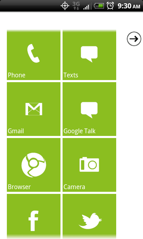
It's difficult to review the software of this phone without going into large rants about Android, fragmentation, and the definition of open-source. So I'll just focus on the SenseUI customizations. This is the first time I've been able to experience the newest version of Sense, and it's even better than the versions I've already loved. All of the software tweaks look gorgeous, and there's a lot more customizations than before. In addition to making the different Scenes (different "profiles" of setups for your widgets) more accessible, HTC added in additional skins, allowing you to change the color scheme and even the shape of some widgets. Some schemes had curved edges to the HTC included widgets, some had them the squared off. Some changed the colors, and my favorite gave everything a wood grain finish. All the skins look amazing and it's a feature that would normally require some rooting to acheive.
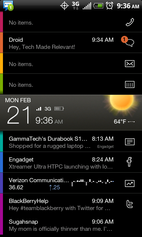
Beyond the aesthetic changes, there are a lot of functionality oriented tweaks. Those familiar with Android are used to the pull-down notification pane for their emails and texts. While this is still there, the pane adds a row for the recently opened apps at the top as well, making it easier to switch between them. You can still hold the Home key to see the 8 most recent, like other Androids, but this is even more convenient to me, though I would like the option to put Wifi, Bluetooth, and other toggles in there as well, like Samsung's skin. The camera interface is also changed a lot. The zoom bar is always visible on screen while not being obtrusive, and the flash and settings windows are easy to get to. The fun effects, like Distortion, Grayscale, and Negative, are also very easy to access.
Speed
I had to do some speed tests to see firsthand if the Inspire was worthy of the 4G title. I compared the Inspire to my HTC EVO side by side for the 3G test. The Inspire killed the EVO and then some. Both phones had 3 steady bars where I did the 3G tests, and the Inspire was in HSPA+. The EVO turned out an average of 400 or so kbps on the download, 200kbps upload. The Inspire rounded out around 2800kbps down, but the upload fluctuated between 120-320kbps. However, if AT&T is going to try to play the 4G name game, it will need to produce a lot more. When I popped on the 4G on my EVO, it sky rocketed to an average of 5300kbps down, 980kbps up, leaving the Inspire in the dust. So for most people in the country, AT&T's faux-4G will work very well; I won't down play it's every day speed. But overall, I think it's premature of AT&T to call anything 4G.
Wrap Up
If you're looking for a really high-powered Android phone on AT&T, the Inspire is a great choice. It is an absolutely gorgeous device, even if it sacrifices a bit of accessibility for the sake of looks. There's nothing cheap about this phone, except its price. Despite the fact that this hardware on most other companies would cost you $200, this guy will go for only $100 with a contract ($450 without) on AT&T and it launches this Sunday, February 13th. Definitely the phone to go for, if you don't want to drop the $200+ for the soon-to-be released Motorola Atrix.
Wednesday, February 9, 2011
RIP Palm or How I Learned to Stop Worrying and Love the HP Bomb
Today, HP had a huge conference unveiling 3 new products, all attempting to reinvigorate the WebOS operating system. The only thing absent from the conference was any mention of Palm, who made WebOS and the Pre, which ultimately failed to sell. It looks like HP, who bought Palm last year, is trying to erase the memory of Palm to bring WebOS back to the spotlight anew.
First off, we have the HP Veer, a very small phone that is the lower end of the WebOS line. It features a 2.6 inch touchscreen and slides up to reveal a small keyboard that will look and feel familiar to Palm Centro users. You also have a 5MP camera (no flash), 8GB of internal storage, and an 800MHz processor, which is all you need for the virtually lag-free WebOS.
Next, the flagship Pre 3. This one has an iPhone sized 3.5 inch touchscreen (just a bit bigger than the Pre 2), and slides up for the keyboard as well. One nice addition is the on-screen keyboard, which was missing on previous versions. The processor is a beastly 1.4GHz processor which will help out with recording in 720p on the 5MP camera. It will come in both 8 and 16GB increments, though which carriers and when weren't discussed for both the Veer and Pre 3.
The big news is the WebOS tablet, the HP TouchPad, that was announced to compete with the iPad and high end Android tablets coming out. It has a screen almost identical in size and clarity to the iPad, has a faster 1.2GHz dual-core processor than the iPad and upcoming Motorola Xoom's 1GHz, and has a front facing camera which will be used for Skype and other video conferencing services. It will come in 3G and 4G variants, but again no mention as to which carriers will have it. The first model launched will be WiFi only and it will have 16 and 32GB versions.
The biggest allure of these devices to me are the connectivity possibilities that HP included. If you connect the devices through Bluetooth, you can use what they call Touch to Share. By simply physically touching a Pre 3 to a TouchPad, whatever website was loaded on one device will be opened on the other.
The tablet wars are definitely heating up, and even if you don't want a WebOS phone, the TouchPad should be seriously considered by potential tablet buyers.
Tuesday, February 8, 2011
World's First Dual-Touchscreen: Kyocera Echo
So, for my first legit post, I figured I might as well talk about an industry first. Yesterday, Sprint and Kyocera unveiled the world's first dual touchscreen phone, the Echo. It runs Android 2.2 and features 2 3.5 inch touch screens, the same size as an iPhone's screen. It can be used with just one screen, as you're probably used to with candybar phones. The main screen then slides up to reveal the second screen. You can use it as one big screen for apps (giving you 4.7 inches of real estate), which is especially good for the apps that have been tweaked for it. For example, the Gmail app can have your message list on the bottom and the full email on the top. Also, it allows for a full screen keyboard.
You can also use the screens for simultaneous apps as well. One screen can be on the browser, then other can be emailing about the site. The top screen can also be tilted for a mini-laptop type of set up.
The Echo will launch sometime this spring and will go for $200 on contract. Check out the official video below to see it in action, complete with how the funky slider works and some obnoxious music!


